Data Analysis of Healthcare Costs in New York State Reveals High Markups for Patients
Revealing the costs of healthcare procedures based on hospital discharge data.
I recently came across multiple news stories and opinion editorials in the Wall Street Journal, Axios, New York Times and NPR, detailing the feelings of frustration and sticker shock people face when confronted with exorbitantly high healthcare bills. I believe part of the problem is that patients don’t know the prices for medical procedures beforehand.
This led me to wonder if healthcare pricing information could be found somewhere for consumers to use and make informed purchasing decisions. In New York State (NYS), a comprehensive data reporting system called SPARCS, is in place which mandates this kind of data collection from hospitals.
“SPARCS is a comprehensive all payer data reporting system established in 1979 as a result of cooperation between the healthcare industry and government. The system was initially created to collect information on discharges from hospitals. SPARCS currently collects patient level detail on patient characteristics, diagnoses and treatments, services, and charges for each hospital inpatient stay and outpatient (ambulatory surgery, emergency department, and outpatient services) visit; and each ambulatory surgery and outpatient services visit to a hospital extension clinic and diagnostic and treatment center licensed to provide ambulatory surgery services.” Source: NYS Department of Health
Of the multiple datasets available through the NYS Department of Health, I chose to explore the 2009–2016 summary cost transparency dataset. This particular dataset contains information from 231 NYS hospitals detailing their volume of inpatient discharges. The discharges are separated by their APR DRG classification and severity of illness. Furthermore, financial information in the form of the average hospital charge and average hospital cost per discharge is available for each APR DRG classification. The terms charge and cost can be thought of as the follows:
- A hospital charges a certain amount to an insurance company or an individual for a medical procedure.
- It costs the hospital a certain amount to perform a medical procedure.
My motivation in analyzing this dataset was simple: present a detailed description of healthcare-related costs in order to give NYS residents purchasing information not previously known.
Note: My data analysis was performed using Python with the Pandas, Numpy and matplotlib libraries because I wanted to learn a new programming language. However, the website containing the dataset already has an intuitive built-in visualization tool (similar to Tableau) allowing for data analysis to be performed by you without having to learn how to code. I encourage everyone to play around with it to get the information they need.
Which APR DRG classifications had the greatest amount of inpatient discharges in NYS?
Since the ultimate goal of my analysis was to reveal the pricing for healthcare procedures, I wanted to start with conditions that had the highest amount of data entries, that way average costs would be more representative of the population.
I began by grouping all APR DRG classifications together (across time and hospitals) and determining which contained the greatest amount of inpatient discharge volume. The APR DRG classification system categorizes patients based on the reason of their hospitalization, the severity of their illness, and their risk of mortality. For my purposes, I used its description as an umbrella term to describe what they were treated for, say heart failure for example. This dataset contained 315 distinct APR DRG classifications. I chose to focus on the top 15 which represented 60% of the entire volume of patient discharges from 2009 to 2016 in NYS. Once I had my top 15 APR DRG classification list, I was curious to look at how inpatient discharges tracked over time for each.
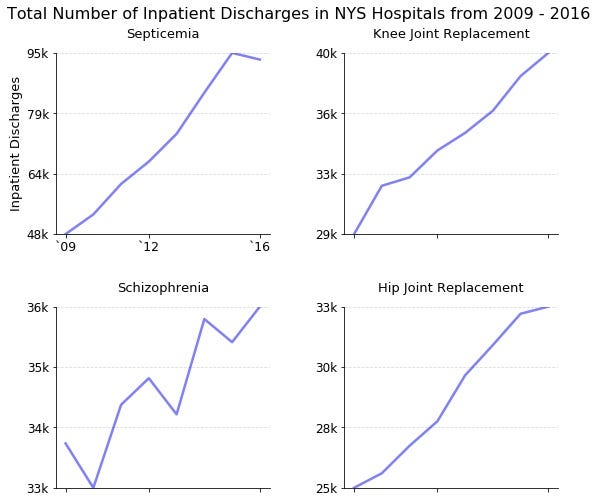
A majority of the top APR DRG classifications saw a decrease in patient volume
Interestingly, 11 of the top 15 APR DRG classifications had decreases in patient volumes from 2009 to 2016. Various types of patient discharge profiles were observed as well. For example, some appeared to have a linear decline (cesarean delivery), others, an increase and then a rapid decline (COPD, cellulitis, kidney and urinary infections, bipolar), while other APR DRG classifications had sharp drop but saw an uptick later (heart failure and kidney and urinary infections).

Childbirth-related procedures accounted for the top 3 classifications people became inpatients
Not surprisingly, childbirth (natural delivery, cesarean delivery, and newborn)-associated procedures were the top 3 APR DRG classifications, representing 17.4% of the total inpatient population in NYS in this time period. This makes sense, since you will always become hospitalized if you present yourself for childbirth.
Increases in patient volumes observed for septicemia, schizophrenia, knee and joint replacement surgery
What I found most interesting were those conditions/procedures that buck the trend and actually had increases in patient volumes. On the rise are the two most common types of orthopedic surgeries (knee and joint replacement), schizophrenia, and quite alarmingly, septicemia (a life-threatening condition due to bacterial infection in the bloodstream).
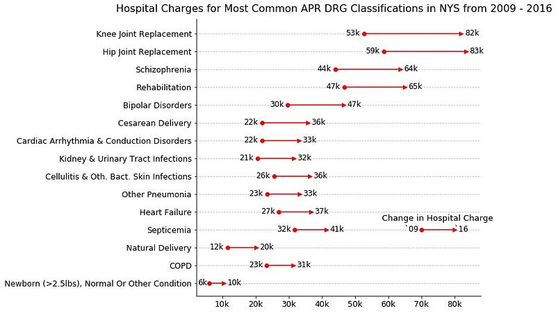
How much did hospitals charge for the most common APR DRG classifications?
Once I had the top 15 APR DRG classifications, I wanted to know how much hospitals charged for each of them. I took the average of the reported mean hospital charge for each APR DRG classification across the entire state in 2009 and 2016. While I recognize that not all hospital care is the same, and prices may differ between them, the data presented here provides an estimate which remains informative to the population on average healthcare costs in NYS. I should mention that the values presented were not adjusted for inflation.
Childbirth is expensive!
Childbirth-related classifications had a moderate increase in price from 2009 to 2016. According to my findings, natural deliveries cost on average $20,000 while cesarean deliveries cost $36,000. Adding on a $10,000 charge for the hospitalization of a healthy newborn, estimated childbirth associated charges can range from $30,000 to $46,000!
Knee and hip replacement surgeries had the largest increase in hospital charges
Interestingly, 3 of the 4 APR DRG classifications that had increasing patient volumes (hip/knee replacement surgery and schizophrenia) also had the highest increases in hospital charges from 2009 to 2016. Both orthopedic surgeries hovered around $80,000 while inpatient care for schizophrenia increased to $64,000. Unfortunately, from this dataset, it cannot be determined if the rise in patient volumes led to the rise in charges or if it was due to other factors.
What is the difference between the hospital charge, and hospital cost, for knee and hip replacement surgeries?
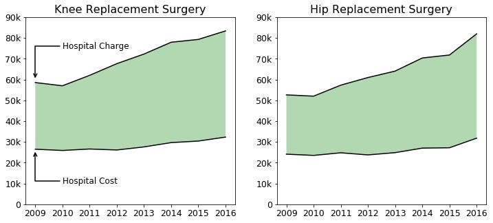
Additional information can be obtained if we look at the differences between hospital charges and costs. I chose to focus on knee and hip replacement surgeries since they each saw the greatest increase from 2009. In this plot, the shaded green area represents the markup, or the difference between what a hospital charges and how much it costs them. The larger the green shaded area, the greater the markup.
In 2009, it cost a hospital an average of $26,000 to perform a knee replacement surgery while they charged $59,000, representing a markup of $33,000 or 127%. In 2016, it cost a hospital an average of $32,000 while they charged $83,000, representing a markup of $51,000 or 159%. Whoa!
For knee and hip replacement surgery the trend is clear: hospital charges are rising and don’t appear to stop. The increase in the percentage markup indicates that hospitals are charging more for the same procedures.
Why is this information useful to know?
A key aspect of sticker shock is the unknown costs of medical procedures. By knowing these estimates beforehand, you are empowered to take action. For example, if you have an upcoming planned procedure (like knee or hip replacement) in the near future, you now know how much you may potentially be liable for in your copay or deductible.
In addition, knowing the prices for procedures or conditions beforehand, you now have greater leverage when discussing care options with your provider or insurance company. Now, you can compare a given quote with the state average, and determine if it is above or below it. This opens the possibility of negotiation, or shopping for other providers.
Finally, and to me, the most important, is that pricing information is no longer hidden from the public. In reality, it never was, these are public datasets after all. But obtaining these values can be challenging. Being informed is a key factor in order to advocate for yourself!
Manuel A. Ramirez Garcia
Biomedical engineering PhD student
Oct 22 2018 from medium.com